
10 App Store Screenshot Mistakes Indie Developers Should Avoid
The most common screenshot mistakes that make app listings look weaker, plus practical fixes for each one.
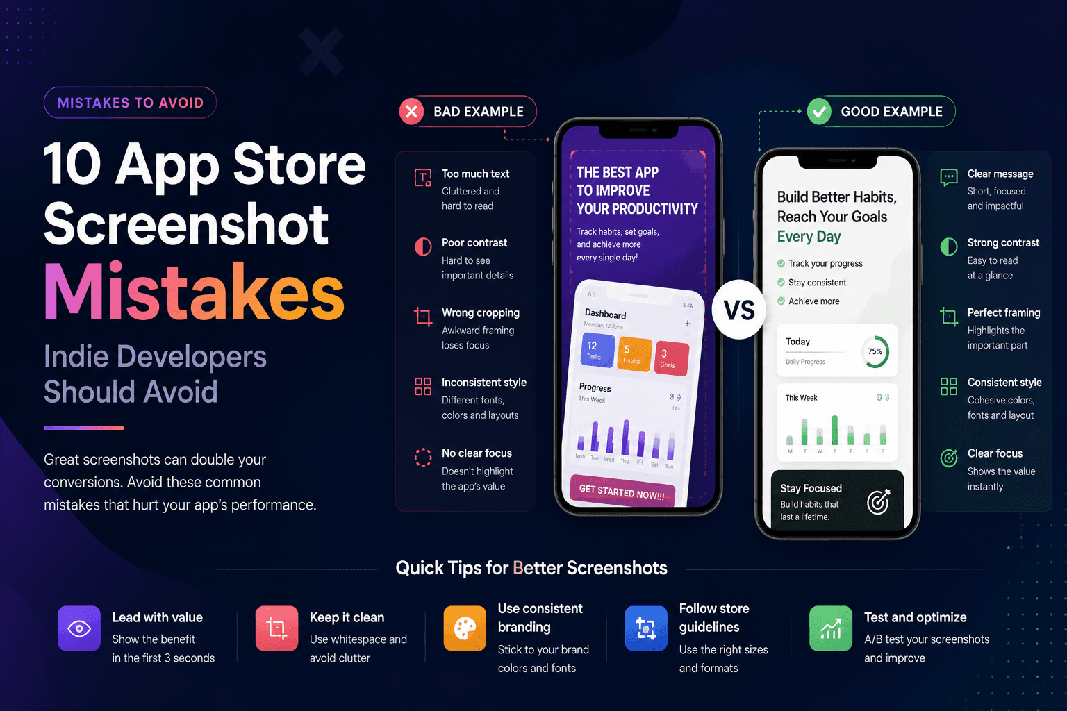
Indie apps often lose downloads because the product looks less polished than it really is. The screenshots may be rushed, inconsistent, too text-heavy, or focused on the wrong screens. The good news: most mistakes are easy to fix.
1. Leading with a login screen
A login screen does not show value. Start with the moment where the user understands what the app helps them do. If the app needs an account, explain that later in the flow, not in the first screenshot.
2. Using captions that describe features instead of benefits
Feature captions like Dashboard, Reports, or Settings are weak because they do not explain why the user should care. Replace them with outcome captions like See every expense clearly or Plan your week in minutes.
3. Making text too small
If the caption is not readable on a phone screen, it might as well not exist. Use larger type, fewer words, and stronger contrast. Test the screenshot at the same size it appears in the store.
4. Mixing too many styles
Different fonts, random colors, inconsistent device frames, and changing layouts make the set feel amateur. Pick one system and repeat it.
5. Showing empty states
Empty dashboards make apps look unfinished. Add realistic sample data before taking screenshots so users can imagine the product in their own life.
6. Cropping important UI
A dramatic crop can look stylish, but do not cut off the part of the screen that explains the feature. The user should understand the product, not just admire the mockup.
7. Using low-contrast backgrounds
If the device blends into the background, the screenshot loses clarity. Use contrast between the phone, background, and caption.
8. Repeating the same message five times
Each screenshot should earn its place. Cover different benefits, workflows, or user objections instead of repeating the same general promise.
9. Ignoring store dimensions
Incorrect sizes create upload friction and visual quality problems. Build directly in the dimensions you need for App Store Connect or Google Play.
10. Waiting until launch day
Screenshots influence positioning, copy, and even product perception. Create a first pass early, then improve it as your launch messaging gets sharper.
Key takeaways
- Lead with value, not login or settings screens.
- Write benefit captions instead of feature labels.
- Use readable text and high contrast.
- Keep the visual system consistent.
- Design screenshots before launch day.
Build faster
Create your next screenshot set in Screenza.
Use a template, replace the screens, edit the copy, and export polished App Store or Google Play screenshots without a design file.