
How to Increase App Store Conversion Rate with Better Screenshots
A practical conversion playbook for App Store screenshots: message hierarchy, sequence structure, and visual decisions that improve installs.
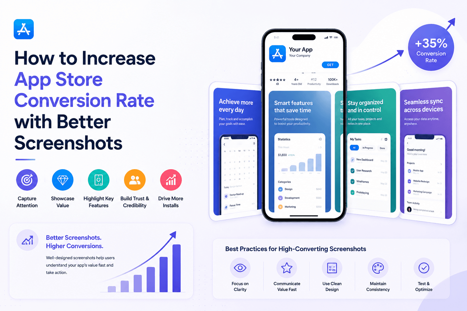
Better screenshots reduce user hesitation. The right sequence and copy clarity can materially improve store conversion without changing your product.
Build a screenshot sequence that sells outcomes
Each screenshot should answer one user question: What is this? Why now? Why this app? Will it fit my workflow?
If multiple screenshots say the same thing, your conversion opportunity is being wasted.
Optimize the first two screenshots aggressively
Users often decide quickly from the first visible visuals. Put your strongest message and clearest product value first.
Second screenshot should validate credibility with a concrete workflow or result.
Use copy and contrast to improve scanability
Short captions with strong contrast beat long explanations every time on mobile.
Make the intended reading path obvious: headline, product visual, then supporting signal.
Measure impact over iterations
Treat screenshots like landing-page copy: publish, observe conversion, refine message order, and repeat.
If you can edit and export quickly in Screenza, you can run more iterations per month and improve conversion faster.
Key takeaways
- Treat screenshot order as a conversion funnel.
- Make screenshot one and two do the heavy lifting.
- Use outcomes, not feature labels, in captions.
- Design for fast scanability on small screens.
Build faster
Create your next screenshot set in Screenza.
Use a template, replace the screens, edit the copy, and export polished App Store or Google Play screenshots without a design file.